Web Design Standards: 10 Best Practices on the Top 50 Websites
Posted by: ANDY CRESTODINA via OrbitMedia
Even for marketers, design standards aren’t something you think about a lot. But for web designers, they’re critical.“Standard web conventions” are web design standards and best practices.They’re a set of rules that web designers follow, knowing that they align with visitors’ expectations. They are guidelines for clarity and usability.
But what is standard, really?
To answer this question, we created a checklist of 10 web design standards, then looked at the top 50 marketing websites to see how standard these standards really are. Using guidelines from an earlier NN Group article, we use the following thresholds:
- Standard: 80% or more of websites use the same design approach
- Convention: 50 – 79% of websites use the same design approach
- Confusion: 49% or fewer websites conform, no single design approach dominates
Note: The sites included in this research are the top marketing websites in the “business > marketing & advertising” category on Alexa. After excluding news, media and publication sites, which do not have conventional lead generation or ecommerce goals, we ended up with the top 50 marketing websites.
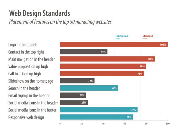
1. Logo in the top left
100% of the websites researched had a clickable logo in the upper left corner of every page on the site. That’s a standard!
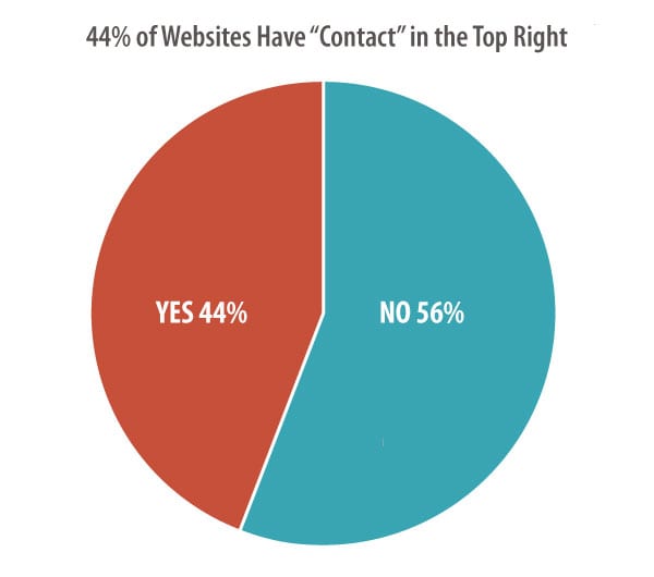
2. Contact in top right
44% have the contact button or link in the top right corner of every page. Although this placement is very common and considered best practices, it cannot be considered standard.
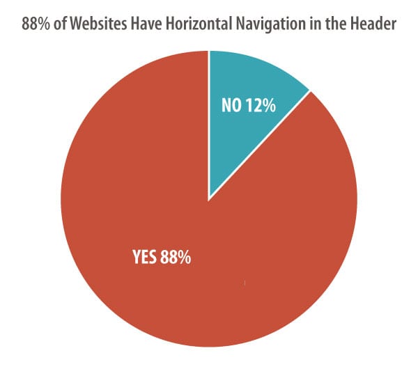
3. Main navigation across the top
88% of the websites had the main navigation located in the header at the top of every page, making horizontal top-level navigation a web design standard.
4. Home page slideshow
32% of the websites have a home page slideshow (also known as a carousel) with a rotating series of images and messages.
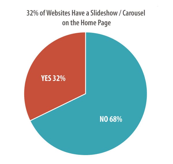
This is one that Orbit designers are watching carefully, as more sites seem to be favoring a static featured image, rather than a rotating series of images.
Research is mixed on the effectiveness of each option. Results vary! Choose the best option for your site, your message and your visitors.
5. Value proposition high up on the home page
80% of marketing websites have an explicit value proposition located high on the home page. So the majority of websites explain their value to visitors “above the fold.” The remaining didn’t have an clear value proposition at all.
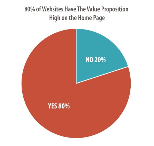
Any web designer will tell you that there is no standard pixel height for browsers. Therefore, there is no fold. But of course, some design elements appear high on pages and are generally visible to the majority of visitors without scrolling.
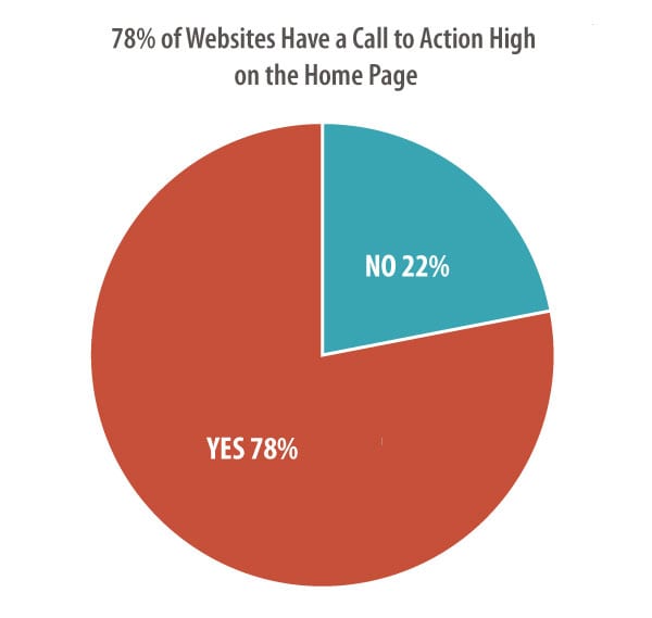
6. Call to Action high up on the home page
78% of the websites had visually prominent calls to action. The percentage fell below our threshold for standard, it’s certainly a convention.
7. Search feature in the header
54% of websites have a search feature in the header. About half of all marketing sites do not have a search feature that appears “globally” on every page either as a link, icon or search box.
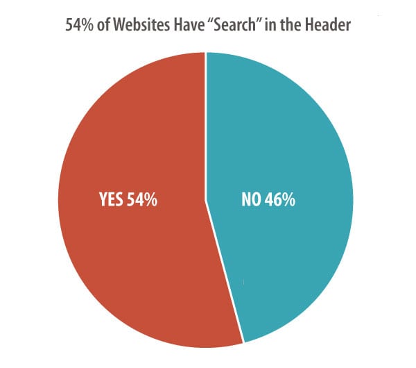
This isn’t surprising to us. Search tools aren’t necessary unless the website contains a large amount of content. A search tool is often a “crutch” for a poorly organized website.
8. Signup box in the footer
24% of websites allow visitors to sign up and subscribe to email updates in the footer. So this is a common place to gather email addresses, but not a convention or a standard.
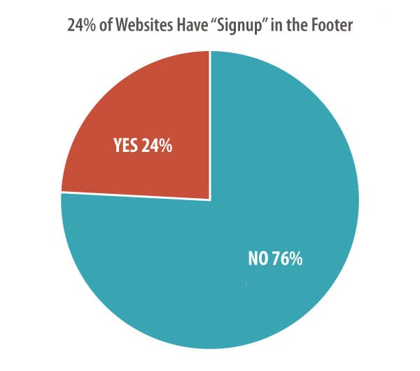
The most common content for footers is copyright, privacy, legal, sitemap and contact links. Visitors expect to find contact information in the bottom right or bottom center of websites.
Want to a better footer? Here are our Footer Design Best Practices, and 27 things you can add to the bottom of your pages.
9. Social media icons in the footer
72% of the websites include icons for social media websites in the footer. This almost makes these a standard design element.
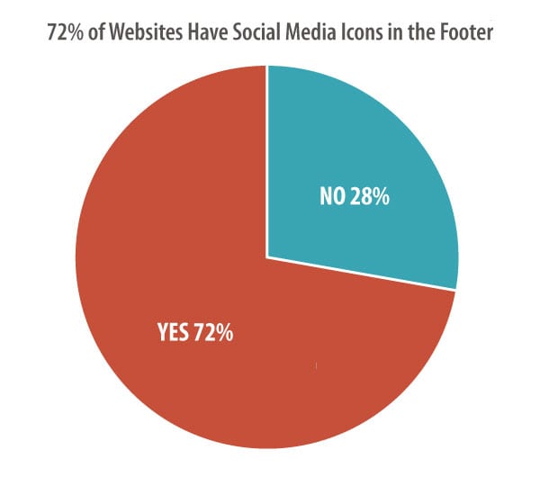
26% of the websites included social media icons prominently in the header.
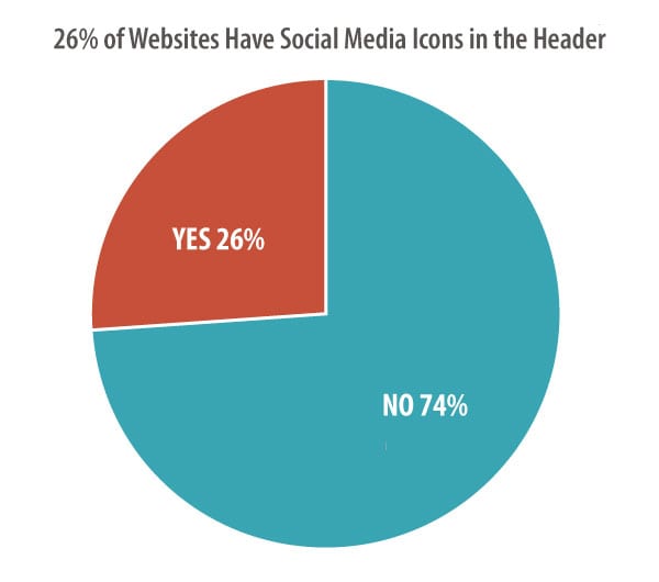
As in the footer, clicking any of these icons takes the visitor to the social media site. For this reason, this is a design element that can cost you traffic, increasing bounce rates and hurt results.
We recommend adding social media icons in the footer. To further reduce visual prominence, the full-color version can appear only after the visitor moves the mouse cursor over the icon.
10. Responsive design
68% of websites are mobile-friendly using responsive web design. This gives visitors a great experience regardless of the device – phone, tablet or desktop.
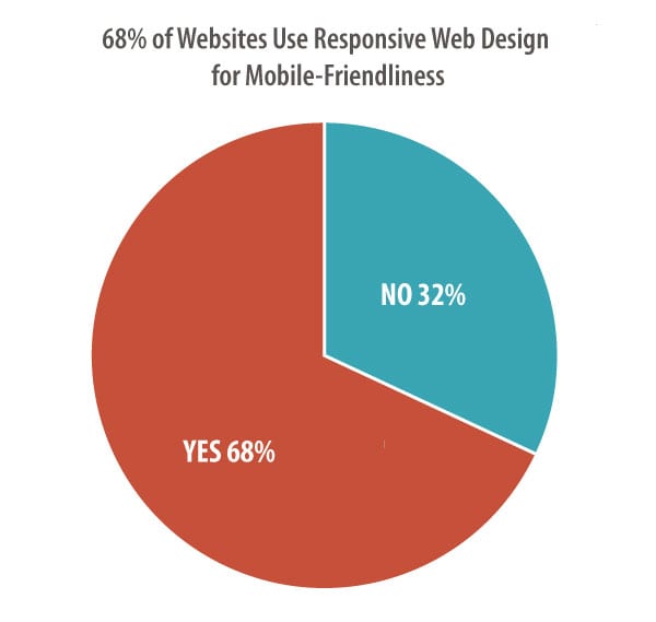
It’s a combination of design and programming that is difficult to add after a site is built. More often, it’s part of a redesign, which may explain why it’s a convention, but not a standard.
Responsive design has been best practices for years. We’re glad to see this become more common and we expect this feature to be standard eventually.
Note about the data: The sites included in this research were big, famous brands. They have lots of pages and diverse businesses. Some design aspects of large sites (search tools, generic navigation labels) may not be relevant to smaller marketing websites.
Let’s review…
Custom Design is Dominant
Obviously, not all design standards are standard after all. Except for the placement of the logo, the main navigation and the value proposition, there aren’t standards for web design.
The nice thing about standards is that you have so many to choose from. – Andy S. Tanenbaum, Computer Scientist
Web design conventions include a prominent call to action, search tool in the header, social media icons in the footer and responsive web design.
Other common design features may still be considered best practices, but may not be used by the majority of websites. Custom web design, specific to the business and its audience, rules the day.
Practical Insights for Web Designers
Conforming to standards are an easy way to meet the expectations of your audience. Your visitors are not blank slates. Your website is the millionth website they’ve visited, so they come with strong ideas about what they’ll find and where they’ll find it. And the website is key to your digital marketing basics.
Why make your site different?
If a design element is expected in a certain place, then that’s where it should go.
Beyond design elements, there are types of web design standards that all good designers understand:
-
Brand Standards
Colors, type and tone are specific to every business. You should have a style guide for your website and stick to it.
-
Coding Standards
Websites should be built using the programming standards agreed upon by the W3C. This makes them more likely to display and behave properly in browsers.
-
Accessibility Standards
Access to information is a basic human right. This has been recognized by the UN Convention on the Rights of Persons with Disabilities. Follow these standards to make your site accessible to everyone.
Standard web conventions are shorthand for good design. If you break any of these rules, you should do so intentionally and with a very good reason. And you should plan on measuring the impact of being unexpected.
Does your site follow best practices? Or do you break the rules?